
Creating a Consistent Typography System for Brands
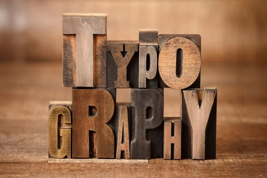
Typography is frequently called the quiet diplomat of the brand. Although images and colors attract consumers’ attention, typography communicates their messages at every touch point. It can be seen in websites, advertisements, packaging, social media graphics, presentations, apps, and print communications. Without consistent typography, well-branded products may fail to look cohesive.
To ensure consistency in typography, a brand should design specific visual rules that help use typography coherently and consistently in all marketing campaigns. This approach enables companies to choose appropriate fonts without improvising each time.
Custom fonts developed especially for particular businesses represent another way to achieve better results with typography.
In this paper, we will consider how typography systems can be created, why they are important, and what effects consistency in typography can have on branding.
Understanding the Purpose of a Typography System
A typography system is more than selecting a font family.
It is a complete framework that defines how text behaves throughout a brand ecosystem.
The system may include:
- Heading sizes
- Font weights
- Paragraph styles
- Line spacing
- Mobile adjustments
- Alignment rules
- Button typography
- Emphasis treatments
Without structure, teams often make typography decisions independently.
Over time, inconsistencies appear.
A typography system creates order.
Every design element follows the same visual language.
Why Brands Need Typography Standards
Brands communicate constantly.
A customer may discover a company through:
- Social advertisements
- Product packaging
- Search results
- Website articles
- Email campaigns
If typography changes from one channel to another, recognition becomes weaker.
Consistency provides benefits such as:
Stronger Brand Identity
Visual repetition improves familiarity.
Faster Recognition
Customers connect typography with brand personality.
Better Professional Appearance
Consistent design increases trust.
Simplified Collaboration
Teams follow the same rules.
Typography standards create efficiency while strengthening identity.
Begin with Audience Expectations
Typography systems should reflect audience behavior.
Different groups respond differently to visual presentation.
For example:
- Corporate audiences often prefer clarity and professionalism.
- Creative industries may accept expressive styles.
- Luxury markets frequently use refined typography.
- Technology brands usually favor clean minimal layouts.
Before creating a system, brands should define:
- User demographics
- Industry standards
- Communication goals
- Emotional direction
Typography becomes more effective when aligned with audience expectations.
Establish Typography Roles Early
Every typography system needs clear roles.
Instead of using fonts interchangeably, brands assign specific functions.
Typical roles include:
Display Typography
Used for large statements and visual impact.
Heading Typography
Supports content structure.
Body Typography
Improves readability.
Functional Typography
Applied to buttons, menus, and labels.
Supporting Text
Captions and secondary information.
Separating roles improves organization.
Designers know exactly where each style belongs.
Selecting the Right Typeface Family
Choosing typography requires balance.
The goal is not simply visual appeal.
Brands should evaluate:
- Readability
- Scalability
- Personality
- Flexibility
- Technical support
Many brands prefer type families with multiple weights because they simplify hierarchy creation.
Large font systems often include:
- Thin
- Regular
- Medium
- Bold
- Extra bold
This flexibility reduces the need for additional fonts.
Consistency becomes easier.
Building Hierarchy Through Typography
Hierarchy guides attention.
Users rarely read every word immediately.
Most scan pages before engaging.
Typography hierarchy helps direct that behavior.
Important elements include:
Primary Headlines
Largest visual focus.
Section Titles
Divide content into topics.
Introductory Text
Provides context.
Body Copy
Delivers information.
Highlight Elements
Draw attention to important details.
Hierarchy improves navigation.
Users process content faster.
Brand messages become clearer.
Creating Spacing Rules
Typography is not only about letters.
Spacing influences readability and visual rhythm.
Brands should define:
Line Height
Controls reading comfort.
Paragraph Gaps
Improves separation.
Letter Spacing
Affects visual density.
Margin Standards
Creates balance.
Poor spacing creates clutter.
Consistent spacing creates professionalism.
Visual rhythm becomes easier to maintain across channels.
Typography Systems for Digital Platforms
Modern branding happens online.
Typography must perform across:
- Websites
- Mobile apps
- Landing pages
- Dashboards
- Social media graphics
Digital environments require responsive systems.
Typography should adapt automatically.
Important considerations include:
- Flexible sizing
- Responsive scaling
- Screen readability
- Contrast levels
Testing typography on real devices prevents usability issues.
Consistency should remain intact regardless of screen size.
The Role of Custom Typography in Branding
Some brands want stronger distinction.
They choose custom fonts to develop exclusive identities.
Custom typography offers advantages such as:
- Unique appearance
- Better recognition
- Competitive differentiation
- Brand ownership
Unlike standard libraries, custom type systems belong specifically to the brand.
This creates stronger visual association.
Large organizations frequently invest in custom typography because it supports long-term consistency.
Exclusive type design becomes part of the identity itself.
Multi-Team Collaboration and Typography Governance
As businesses grow, multiple teams contribute to branding.
Marketing teams.
Web designers.
Social media managers.
Packaging specialists.
Without clear typography guidelines, inconsistencies appear quickly.
A governance system helps maintain standards.
Documentation often includes:
- Font usage rules
- Size charts
- Responsive instructions
- Approved combinations
- Accessibility requirements
Clear guidance improves collaboration.
Everyone works within the same framework.
Typography and Emotional Consistency
- Brand emotion should remain stable.
- Typography influences emotional perception.
- Rounded letterforms often feel friendly.
- Sharp geometry may appear modern.
- Thin elegant text can communicate luxury.
- Heavy bold styles suggest confidence.
- Typography systems should support emotional goals.
- Consistency creates stronger audience connections.
- Visual identity becomes more memorable.
- Emotion and typography work together.
Accessibility as a Core Requirement
Accessibility should never be added later. It belongs inside the typography system from the beginning.
Key practices include:
Maintain Readable Sizes
Tiny text reduces usability.
Ensure Strong Contrast
Text must remain visible.
Control Line Length
Very long paragraphs reduce comfort.
Avoid Excess Decoration
Complex typography harms readability.
Accessible typography improves experiences for:
- Mobile users
- Older audiences
- International visitors
- Users with visual challenges
Inclusive systems perform better overall.
Expanding Typography Across Brand Assets
Typography systems must work everywhere.
Common applications include:
Packaging Design
Product presentation.
Advertising
Campaign consistency.
Social Content
Quick recognition.
Presentation Slides
Internal communication.
Email Marketing
Professional appearance.
Printed Materials
Offline branding.
A strong typography system adapts easily.
Consistency remains even when channels change.
Measuring Typography Performance
Brand systems should evolve.
Typography performance can be evaluated through:
- Engagement rates
- User feedback
- Heatmaps
- Scroll behavior
- Reading completion
Data reveals whether typography supports communication.
Testing identifies weaknesses.
Small improvements often produce better results.
Typography becomes part of optimization strategy.
Future Trends in Brand Typography Systems
Typography continues changing.
Emerging trends include:
Variable Typography
Flexible responsive design.
Motion-Based Text Systems
Interactive experiences.
AI Typography Suggestions
Smarter workflows.
Adaptive Branding
Typography responding to context.
Personalized Experiences
Different audiences receive tailored presentations.
Future typography systems will likely become more dynamic.
Consistency will remain important.
Flexibility will increase.
Maintaining Typography Over Time
Brand systems require maintenance.
As businesses expand, typography must support:
- New campaigns
- Product launches
- Additional markets
- International audiences
Long-term planning helps avoid redesign problems.
Some companies expand their systems with custom fonts because they offer greater control and scalability.
Typography should grow with the brand.
Consistency becomes easier when future needs are considered early.
Conclusion
Establishing a coherent typography system is one of the most valuable endeavors for a brand to undertake. Typography plays a vital role in recognition, legibility, emotional appeal, and the visual identity of brands regardless of which communication channels we are referring to.
A good typography system establishes criteria for hierarchy, spacing, responsiveness, accessibility, and use cases.
Following such a system eliminates inconsistencies and enhances collaboration.
Companies looking to distinguish themselves from their competition might spend money on developing customized fonts.
Typography is more than just styling of texts. It is a critical element in brand strategy.