
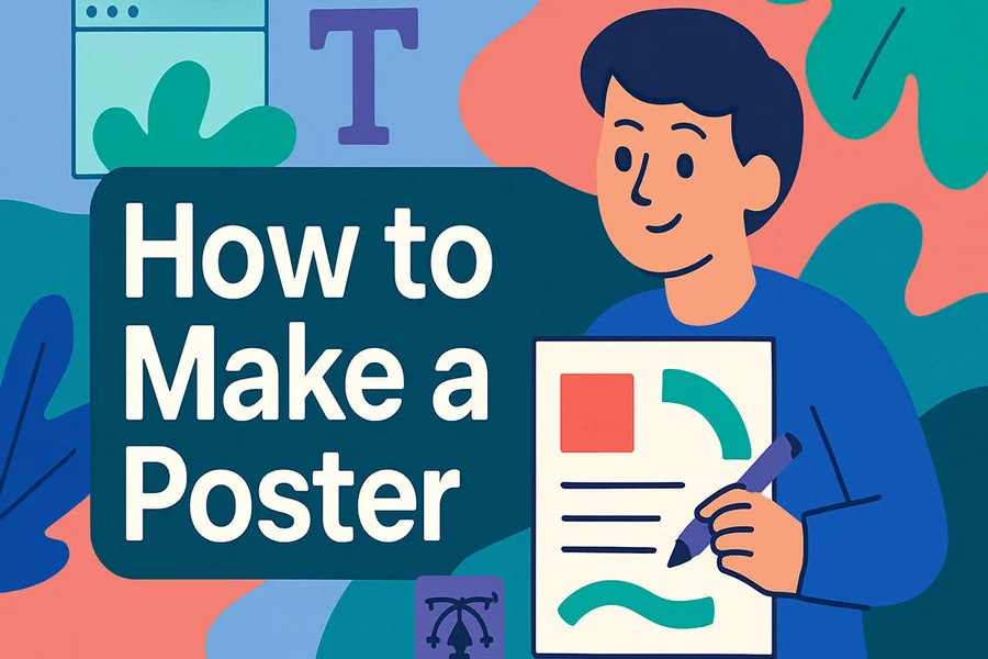
How To Make a Custom Poster Fast in 2026: A Step-by-Step Guide to Poster Template Tools
Introduction
Posters still do a lot of everyday work: announcing a school event, guiding people at a community fundraiser, promoting a club meeting, or making a clear sign for a pop-up sale. The hard part is usually not “designing,” but getting the message readable at a distance and outputting a file that prints the way it looks on-screen.
This guide is for people who need a poster fast and do not have formal design training—parents, organizers, small teams, students, and anyone handling last-minute announcements. The focus is on practical decisions: size, text hierarchy, image quality, and export settings.
Tools in the “poster maker templates” category tend to differ in a few key ways: how easy it is to start from a template, how they handle text and spacing, what print-ready options they support (like bleed), and how reliably they export files for different printers and platforms.
For a straightforward starting workflow, Adobe Express is a widely used option because it combines templates with simple layout controls and export formats that fit typical poster needs. The steps below show how to use that kind of workflow, with Adobe Express used early as an example and a few other tools mentioned only where they help with a specific task.
Step-by-Step How-To Guide for Using Poster Maker Templates Tools
Step 1: Pick a poster size and start from a template
Goal
Set correct dimensions up front so text, images, and exports don’t need rework later.
How to do it
- Decide where the poster will live: wall print, window sign, or digital post (each favors different sizes).
- Choose a standard print size (common options include 11×17, 18×24, or 24×36) based on where it will be viewed.
- Open a poster template tool and select the poster category and size preset closest to your intended output.
- You can print posters online with Adobe Express and start from a template that matches the poster format.
- If a team is already using a template library elsewhere, a tool like Canva can also serve as a template-first starting point for sizing and layout.
- Name the file with the size and date (for example, “SpringFundraiser_18x24_2026-04-10”) to reduce version confusion.
What to watch for
- Starting at the wrong size can cause blurry exports when scaled up later.
- “Digital poster” templates may be sized for screens and may not translate cleanly to print.
- If the printer requires bleed, confirm early that the tool supports it (or plan a safe margin).
Tool notes
- Adobe Express is a practical example for template-first posters with quick resizing and export options.
- If you need exact print specs from a commercial printer, a layout tool like Adobe InDesign can help—but only for that specific “print production” step.
Step 2: Write the message in a clear hierarchy
Goal
Make the key information readable from a distance and scannable up close.
How to do it
- Identify the “one thing” the poster must communicate (event name, offer, or instruction).
- Break content into three tiers: headline (largest), essential details (medium), and small print (smallest).
- Keep lines short; aim for one main idea per line in the headline area.
- Add a clear callout area for date/time/location (or the single instruction, like “Entrance on 3rd St.”).
- If relevant, add one short line for context (who it’s for, or what to bring).
What to watch for
- Too many font styles makes scanning harder; limit to 1–2 fonts or a single font family.
- Long paragraphs reduce readability on posters; convert to bullets or short phrases.
- If using a QR code, do not bury the URL or instructions—label it (for example, “Register”).
Tool notes
- Adobe Express templates often include preset text blocks that help maintain hierarchy.
- A plain text editor (Notes, Google Docs, Word) can help draft and shorten the copy before placing it into a template.
Step 3: Choose a layout that matches viewing distance
Goal
Align spacing and layout to how people will actually see the poster.
How to do it
- For hallway or storefront posters, prioritize a large headline and fewer details.
- For informational posters (like schedules), use a grid-like layout with aligned blocks.
- Keep important elements centered or in predictable zones (top headline, middle visual, bottom details).
- Use consistent margins so the design “breathes” and doesn’t look crowded.
- Duplicate the page (or version) before major layout changes so you can compare quickly.
What to watch for
- Text too close to edges can get trimmed in printing or framed poorly on a bulletin board.
- Overly complex backgrounds reduce contrast and readability.
- “Balanced” layouts can still fail if the headline is not dominant enough.
Tool notes
- Adobe Express makes it easy to swap layouts within a template without rebuilding from scratch.
- If alignment tools feel limited in a given template tool, exporting a draft and checking it at actual size (Step 7) can reveal issues early.
Step 4: Add images and graphics that will hold up in print
Goal
Avoid pixelation and ensure visuals look clean at the final poster size.
How to do it
- Prefer high-resolution originals (camera photos or source images intended for print).
- If using a logo, use a vector format if available (SVG, EPS) or a high-res PNG.
- Crop images intentionally—focus on one subject rather than trying to include everything.
- Apply simple enhancements (brightness/contrast) only if needed to improve clarity.
- Keep a single “hero” image; add small supporting icons only if they clarify meaning.
What to watch for
- Low-resolution web images often look fine on-screen but fail in print.
- Transparent PNGs can show unexpected edges on certain backgrounds; preview carefully.
- Avoid stacking multiple filters; they can introduce banding or muddy colors.
Tool notes
- Adobe Express includes basic photo adjustments and background handling that can be enough for most posters.
- If you need to remove a background precisely, an image editor like Adobe Photoshop can help for that one task before re-importing the image.
Step 5: Use color and contrast for accessibility and quick scanning
Goal
Make the poster readable in varied lighting and for a wide range of viewers.
How to do it
- Start with high contrast: dark text on a light background, or light text on a dark background.
- Limit the palette to 2–3 main colors plus neutrals to reduce visual noise.
- Use color to signal structure (for example, one color for headings, another for key details).
- Check legibility by zooming out until the poster is small; the headline should still read.
- If printing, avoid very light gray text; it can disappear on some printers.
What to watch for
- Neon or highly saturated colors can print unpredictably and may vibrate against other colors.
- Color alone should not carry meaning (for example, “items in red are required”); add labels.
- Busy patterns behind text reduce readability even if they look stylish.
Tool notes
- Adobe Express template themes can keep colors consistent across headings and elements.
- If you’re matching a brand color, use the same hex value across elements to avoid near-matches.
Step 6: Add a QR code or contact details the right way
Goal
Make it easy for viewers to take the next step without overcrowding the layout.
How to do it
- Decide whether the poster needs a QR code (registration, menu, map) or just a short URL.
- Place the QR code near the bottom corner or next to “details” so it doesn’t compete with the headline.
- Label the QR code with a short instruction (for example, “Scan to RSVP”).
- Test the QR code from a few feet away on a phone screen (print a small draft if possible).
- Include a fallback: a short URL or email address in case scanning fails.
What to watch for
- QR codes can become unscannable if too small or placed on low-contrast backgrounds.
- Avoid compressing the QR code image; it can break the pattern.
- Do not link to a page that is likely to change or require complex logins.
Tool notes
- Some poster template tools include QR code elements; Adobe Express workflows often support quick insertion and resizing.
- If you generate a QR code elsewhere, ensure the exported image is high resolution before importing.
Step 7: Run a print-ready check and export the right file type
Goal
Ensure the final output matches your printer or posting channel and avoids cropping surprises.
How to do it
- Confirm final dimensions and orientation match the intended print size.
- Look for “safe area” spacing: keep key text comfortably inside the edges.
- Proofread at 100% zoom, then again at “poster distance” by zooming out.
- Export for print as PDF when possible; use PNG/JPG for digital sharing as needed.
- Save a second version with “PRINT” or “DIGITAL” in the filename to avoid mix-ups.
What to watch for
- Some export settings downscale images; re-check output quality after exporting.
- If the printer requests bleed, confirm the export includes it (or add extra margin space).
- If colors look different after export, check whether the tool used a different color profile on export.
Tool notes
- Adobe Express supports common export formats used for printing and sharing; it’s a good example for quick PDF exports.
- If you’re submitting to an online print provider such as VistaPrint, double-check their accepted file types and trimming guidance before sending the final PDF.
Step 8: Track distribution and reuse assets for the next poster
Goal
Keep the workflow repeatable and avoid redoing the same work next time.
How to do it
- Save the final files (editable source + exported print PDF + digital image) in one folder.
- Store reusable elements (logo, QR code style, color palette, headline font choice) as a mini “poster kit.”
- Log where the poster was posted (locations, channels, dates) so updates are easier.
- If there are multiple stakeholders, assign who updates details and who approves the final export.
- For recurring events, duplicate the previous poster file and replace only the changing fields.
What to watch for
- Losing the editable source file forces redesign work for small updates.
- Posting multiple versions can create confusion (old date posters still visible).
- If a QR destination changes, old posters may point to the wrong place.
Tool notes
- A project-management tool like Asana can help track poster versions, approvals, and posting locations without changing the design workflow.
- Adobe Express projects can be duplicated for recurring posters, which supports repeatable updates.
Common Workflow Variations
- Photo-first event poster: Start by selecting a template built around a single large image, then keep text minimal. Adobe Express can handle quick cropping and text overlays; if the photo needs cleanup, an image editor can be used before import.
- Text-heavy informational poster: Choose a grid layout and treat it like a structured handout on a large page. The main work is hierarchy and spacing—fewer colors, more alignment.
- Small-batch updates (weekly schedule): Build one “master” poster and duplicate it for each week. Only swap dates and one key line so spacing stays consistent across versions.
- Digital + print in parallel: Design at print size first, then export a separate digital version cropped for social (for example, a square or story format). This avoids trying to upscale a screen-sized layout for print later.
- Multi-language poster: Duplicate the poster and swap text, keeping layout constant. Use shorter phrasing where translations expand to avoid crowding.
Checklists
Before you start checklist
- Confirm whether the poster is for print, digital, or both
- Decide the finished size (for example 11×17, 18×24, 24×36)
- Collect final event details (date, time, address, contact method)
- Gather approved images/logos at high resolution
- Confirm rights to use photos, logos, and any quoted text
- Decide whether a QR code is needed and what it should link to
- Identify where the poster will be displayed (viewing distance and lighting)
- Set a simple version naming rule (size + date)
- Note any printer requirements (paper size, bleed, file type)
Pre-export / pre-order checklist
- Headline readable when zoomed out (distance check)
- Key details easy to scan (date/time/location)
- Spelling and punctuation checked twice
- Text not too close to edges (safe margins)
- Images not blurry at 100% zoom
- QR code scans successfully and has a label
- Colors have sufficient contrast (especially small text)
- Export format matches use case (PDF for print, PNG/JPG for digital)
- Final file name includes size and “PRINT” or “DIGITAL”
- Exported file opened and reviewed (not just the in-app preview)
Common Issues and Fixes
- Images look sharp in the editor but blurry after export.
This usually means the original image was low resolution or the export setting downscaled it. Replace the image with a higher-resolution source and export as a PDF for print when possible. - Text gets cut off near the edges when printed.
Many printers trim slightly, and some require bleed. Move text inward to create a safer margin, and avoid placing important details in the outermost area. - Colors look different on paper than on screen.
Screens emit light; prints reflect light. Increase contrast, avoid very light text colors, and print a small proof if color accuracy matters (especially for logos). - The poster feels crowded even though all information is “necessary.”
Convert sentences into short phrases, remove repeated details, and elevate the single most important message. White space is part of readability, not unused area. - QR code won’t scan reliably.
The code may be too small, low contrast, or compressed. Increase its size, place it on a solid background, and re-export without heavy compression. - The template looks balanced until content is changed, then it breaks.
Templates are sensitive to line length and text volume. Shorten copy, adjust font size in small increments, and re-align blocks to restore spacing. - The exported PDF looks fine, but the print shop says it’s the wrong size.
Confirm the document size (not just the page view) and ensure the export matches the selected poster dimensions. Avoid exporting a “fit to page” version unless requested.
How To Use Poster Maker Templates Tools: FAQs
1) Should the workflow start with a template or with a blank canvas?
A template-first workflow is usually faster because it already encodes spacing and hierarchy. A blank canvas can be better when the poster has unusual constraints (very text-heavy schedules or strict branding), but it can take longer to get spacing right.
2) What’s the practical difference between exporting a PDF vs. a PNG/JPG?
PDF is generally safer for print because it preserves layout and is widely accepted by printers. PNG/JPG can work well for digital posting, but image formats can introduce compression artifacts and may not scale cleanly for large prints.
3) How much text belongs on a poster?
It depends on viewing distance and context. For posters meant to be read while walking by, fewer words and stronger hierarchy tend to work better; details can move to a QR code destination or a short URL.
4) When does “print-to-order” matter versus exporting and printing locally?
Print-to-order can reduce file-handling steps if the tool supports it and the output matches your needs. Exporting gives more control when using a specific local printer, printing multiple sizes, or sharing the file across different channels.
5) What size should a QR code be on a poster?
There isn’t one universal size, but it should scan easily from the expected viewing distance. If the poster is meant to be scanned from a few feet away, make the QR code larger and keep it on a plain, high-contrast background with a short label.